Difference between revisions of "Component Properties"
| Line 6: | Line 6: | ||
To bring up a components attributes and properties you can right click on a selected component and click 'Properties' from the context menu. | To bring up a components attributes and properties you can right click on a selected component and click 'Properties' from the context menu. | ||
[[File:Gen_Component_Context_Menu_Properties_LEDarray.png|center]] | [[File:Gen_Component_Context_Menu_Properties_LEDarray.png|center]] | ||
| − | This will bring up the 'Properties Panel' (as | + | This will bring up the 'Properties Panel' (as displayed to the right), there you can see the components attributes and properties. |
If the Properties Panel is already being displayed simply click on a component to bring up it's properties on the panel. | If the Properties Panel is already being displayed simply click on a component to bring up it's properties on the panel. | ||
Revision as of 14:08, 4 July 2013
<sidebar>Sidebar: Taking Flowcode Further</sidebar>
Component properties controls how the component functions and where it is situated on the System Panel or Dashboard Panel, you can directly alter the location of the component using the 'World coordinates' under the 'Position' section of the Properties Panel, you can also manipulate the component by using the 'Scale' section to change the size (and shape) of the component as well as the 'Rotation' section to rotate the component in the panel.
To bring up a components attributes and properties you can right click on a selected component and click 'Properties' from the context menu.
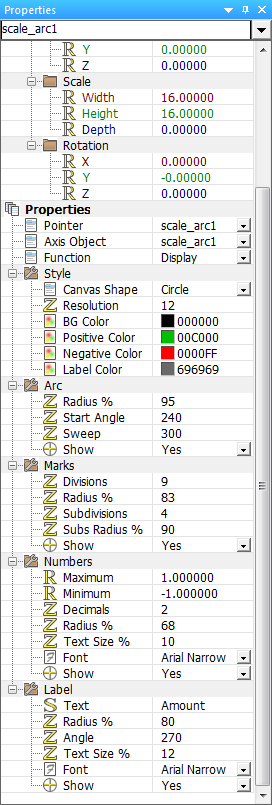
This will bring up the 'Properties Panel' (as displayed to the right), there you can see the components attributes and properties.
If the Properties Panel is already being displayed simply click on a component to bring up it's properties on the panel.
The properties for the component can be edited in the Properties Panel by simply clicking the property value and/or typing in a value, this depends on the component and the property, many components have similar properties and some serve a completely different purpose because of the radical difference between some components.
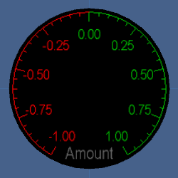
There are many different properties used in a range of different components, take the Scale Arc component for example, this offers a vast range of properties to customize the appearance and function of the component.
The Scale Arc component properties allow you to change the colour of the negative and positive markings, labels and backgrounds as well as the resolution and shape of the canvas.
There are many other properties available to change to customize the component to suit your desired purpose, you can change nearly every aspect of the Scale Arc just by changing the properties of the component.
Extra help for that specific component can be found by searching for the component name or GUID on this wiki.

