Difference between revisions of "System Panel"
| (86 intermediate revisions by 5 users not shown) | |||
| Line 1: | Line 1: | ||
| − | [[File: | + | [[File:SystemPanel.png|thumb||The System Panel]] |
The System panel provides a real-world framework on which to load Flowcode components that compliments the [[Dashboard Panel]]. It is designed to show the physical representation of real world components during simulation. | The System panel provides a real-world framework on which to load Flowcode components that compliments the [[Dashboard Panel]]. It is designed to show the physical representation of real world components during simulation. | ||
__TOC__ | __TOC__ | ||
| + | |||
== Overview == | == Overview == | ||
| − | The System Panel is opened by selecting it in the View menu. | + | The System Panel is opened by selecting it in the View menu. Unlike the [[Dashboard Panel]], the System Panel is designed to simulate a 3D environment. It is best suited to designing and positioning objects as all aspects of an object can be viewed. Once an object is designed, it is often used in projects via the [[Dashboard Panel]]. |
| − | When it opens, you see a central coloured square, called the ''Table top'', set against a coloured background. The colours or images of both are set in the | + | When it opens, you see a central coloured square, called the ''Table top'', set against a coloured background. The colours or images of both are set in the 'General Options'. [[File:GeneralOptionsIcon.png|border]] |
| − | The System panel has | + | The System panel has a '''Controls''' toolbar running horizontally across the top, much like the [[Dashboard Panel]]. |
| − | [[Component|Components]] can be added to the System panel from the [[Tools and Views#3)Components Toolbar|Components Toolbar]]. Then, input devices like [[Component ID 953a042a b2aa 4f2e 94e2 ee2979cfc92e|switches]] can be operated to control the progress of the simulation, while output devices, like [[Component ID a7b05886 784c 48c8 a6f6 cc371c7728e1|LEDs]] show the result. | + | [[Component|Components]] can be added to the System panel from the [[Tools and Views#3)Components Toolbar|Components Toolbar]]. Then, input devices like [[Component: ID 953a042a b2aa 4f2e 94e2 ee2979cfc92e|switches]] can be operated to control the progress of the simulation, while output devices, like [[Component: ID a7b05886 784c 48c8 a6f6 cc371c7728e1|LEDs]] show the result. |
| + | ===Dashboard or System Panel?=== | ||
| + | To find out more about the differences between the Dashboard and System panel and also recommendations on how to use the two panels for different types of projects please see the article [[Choosing your Simulation Panel|Choosing your Simulation Panel]] | ||
===Table top=== | ===Table top=== | ||
| Line 18: | Line 21: | ||
It is also useful as a surface for shadows, giving a sense of depth and orientation. The rotate mode of the camera treats the table top as the 'ground' and keeps the camera orientated with this in mind. | It is also useful as a surface for shadows, giving a sense of depth and orientation. The rotate mode of the camera treats the table top as the 'ground' and keeps the camera orientated with this in mind. | ||
| − | |||
| − | |||
| − | + | ===Axis alignment=== | |
| − | + | The coloured arrows in the top left corner of the panel show the orientation of the camera. You can click any of these arrows to reset the view to look in that axis. | |
| − | |||
| − | |||
| − | |||
| − | |||
| − | + | For example, clicking on the blue arrow gives a top-down view – looking down the ‘Z’ axis. Clicking on one of the other coloured arrows rotates the object about that axis. | |
| − | |||
| − | |||
| − | |||
| − | |||
| − | |||
| + | ''Hint:'' | ||
| + | :The coordinates of the cursor are shown in the status bar at the bottom of the screen. Using this information can help you to position objects. | ||
| − | + | :First of all, move the cursor to the desired position, to find its coordinates. Then enter these into the 'Position' [[Component Properties|properties]] of the object in the [[Properties Panel]]. | |
| − | |||
| − | |||
| − | + | ==Manipulating objects== | |
| − | |||
| − | + | ===Selecting items=== | |
| − | |||
| − | ==Selecting items== | ||
Multiple items can be selected: | Multiple items can be selected: | ||
| − | * By holding down the | + | * By holding down the '''Shift''' key and then clicking on a number of items, one after the other; |
* By left-clicking the mouse button and dragging over the items. | * By left-clicking the mouse button and dragging over the items. | ||
They can then be grouped: | They can then be grouped: | ||
| − | * By clicking on the ' | + | * By clicking on the 'Group' icon. [[File:Gen_Panel_Object_Group_01.png|border]] |
| − | * By selecting the | + | * By selecting the 'Group' option from the ‘Selection’ menu which appears when you click the right-hand mouse button. |
| − | In this way, complex [[Component | + | In this way, complex [[Component Tree|nested structures]] can be assembled from a number of parts. |
To ungroup, select the object and then click on the same icon. | To ungroup, select the object and then click on the same icon. | ||
| − | |||
| − | |||
| − | |||
| − | + | == Multiple views== | |
| − | + | A powerful feature of Flowcode is the ability to view the components from several camera angles simultaneously, enabling orthographic design of the system. Up to four views can be shown. | |
| − | |||
| − | |||
| − | |||
| + | The number of views can be changed by clicking the 'General Options' [[File:Gen Panel General Options 01.png|border]] icon and then clicking on the drop down menu [[File:Btn_Menu_Arrow.png]] next to the 'Number of views:' option and then selecting a value from 1-4 on the menu. | ||
| − | + | By clicking on the appropriate arrowheads, you can set up each view as shown below. | |
| − | |||
| − | |||
| − | |||
| − | [[File: | + | Depending on the size and shape of the Systems Panel, the three views may be arranged vertically, instead of horizontally. Drag one edge of the Systems Panel sideways to see this effect. |
| + | [[File:gen_exerciseSystemPanelshapecontrol_threeview1_01.png|500px|center]] | ||
| − | + | You can adjust the viewpoint individually for each view, by operating the 'camera position' controls. | |
| − | [[File: | + | An example of doing so is given below - notice the positions of the red, green and blue arrows in each: |
| + | [[File:gen_exerciseSystemPanelshapecontrol_threeview2_01.png|500px|center]] | ||
| − | + | Alternatively, you can make changes to the objects themselves, in which case all three views are affected at once. | |
| − | + | In the next image, the instrument panel has been rotated: | |
| − | + | [[File:gen_exerciseSystemPanelshapecontrol_threeview3_01.png|500px|center]] | |
| − | |||
| − | |||
| − | |||
| − | |||
| − | |||
| − | |||
| − | |||
| − | |||
| − | |||
| − | |||
| − | |||
| − | |||
| − | |||
| − | |||
| − | |||
| − | |||
| − | |||
| − | [[File: | ||
| − | |||
| − | |||
| − | |||
| − | |||
| − | |||
| − | |||
| − | |||
| − | |||
| − | |||
| − | |||
| − | |||
| − | |||
| − | |||
| − | |||
| − | |||
Latest revision as of 08:46, 2 July 2019
The System panel provides a real-world framework on which to load Flowcode components that compliments the Dashboard Panel. It is designed to show the physical representation of real world components during simulation.
Contents
Overview
The System Panel is opened by selecting it in the View menu. Unlike the Dashboard Panel, the System Panel is designed to simulate a 3D environment. It is best suited to designing and positioning objects as all aspects of an object can be viewed. Once an object is designed, it is often used in projects via the Dashboard Panel.
When it opens, you see a central coloured square, called the Table top, set against a coloured background. The colours or images of both are set in the 'General Options'. ![]()
The System panel has a Controls toolbar running horizontally across the top, much like the Dashboard Panel.
Components can be added to the System panel from the Components Toolbar. Then, input devices like switches can be operated to control the progress of the simulation, while output devices, like LEDs show the result.
Dashboard or System Panel?
To find out more about the differences between the Dashboard and System panel and also recommendations on how to use the two panels for different types of projects please see the article Choosing your Simulation Panel
Table top
The Table top provides a 'surface' on which components are placed. It is a flat plane that objects can be placed on. When locked to the Table top, all objects sit on top of it and interact as solid objects.
It is also useful as a surface for shadows, giving a sense of depth and orientation. The rotate mode of the camera treats the table top as the 'ground' and keeps the camera orientated with this in mind.
Axis alignment
The coloured arrows in the top left corner of the panel show the orientation of the camera. You can click any of these arrows to reset the view to look in that axis.
For example, clicking on the blue arrow gives a top-down view – looking down the ‘Z’ axis. Clicking on one of the other coloured arrows rotates the object about that axis.
Hint:
- The coordinates of the cursor are shown in the status bar at the bottom of the screen. Using this information can help you to position objects.
- First of all, move the cursor to the desired position, to find its coordinates. Then enter these into the 'Position' properties of the object in the Properties Panel.
Manipulating objects
Selecting items
Multiple items can be selected:
- By holding down the Shift key and then clicking on a number of items, one after the other;
- By left-clicking the mouse button and dragging over the items.
They can then be grouped:
- By clicking on the 'Group' icon.

- By selecting the 'Group' option from the ‘Selection’ menu which appears when you click the right-hand mouse button.
In this way, complex nested structures can be assembled from a number of parts. To ungroup, select the object and then click on the same icon.
Multiple views
A powerful feature of Flowcode is the ability to view the components from several camera angles simultaneously, enabling orthographic design of the system. Up to four views can be shown.
The number of views can be changed by clicking the 'General Options' ![]() icon and then clicking on the drop down menu
icon and then clicking on the drop down menu ![]() next to the 'Number of views:' option and then selecting a value from 1-4 on the menu.
next to the 'Number of views:' option and then selecting a value from 1-4 on the menu.
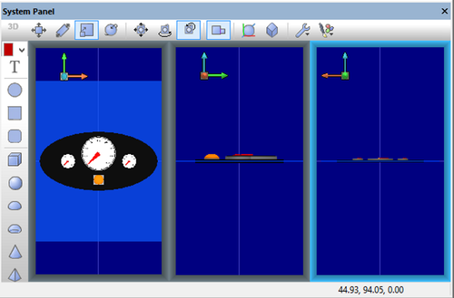
By clicking on the appropriate arrowheads, you can set up each view as shown below.
Depending on the size and shape of the Systems Panel, the three views may be arranged vertically, instead of horizontally. Drag one edge of the Systems Panel sideways to see this effect.
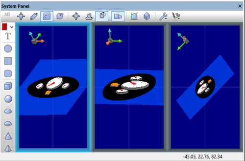
You can adjust the viewpoint individually for each view, by operating the 'camera position' controls.
An example of doing so is given below - notice the positions of the red, green and blue arrows in each:
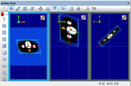
Alternatively, you can make changes to the objects themselves, in which case all three views are affected at once.
In the next image, the instrument panel has been rotated:


